hipos.com
Hipos.com is an online financial supermarket in Mexico. The purpose of this site is to help users understand what is necessary to get a mortgage, credit, and insurance. I was in charge of creating a complex online tool for users to compare and apply to products they offer setting up a login account.

Process
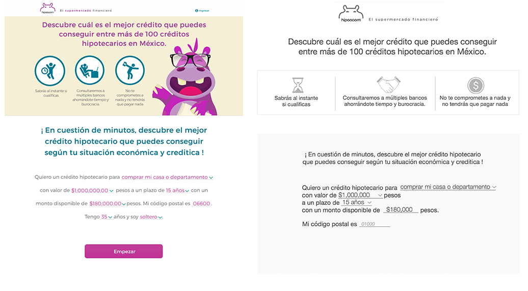
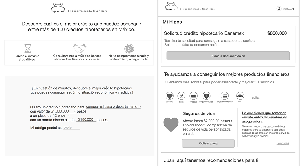
Hipos.com was a very complex project because there is no financial or online culture in México. It is the first online supermarket financial store in México; therefore, I had to make the words and design extra user friendly since the users understand nothing about finances.
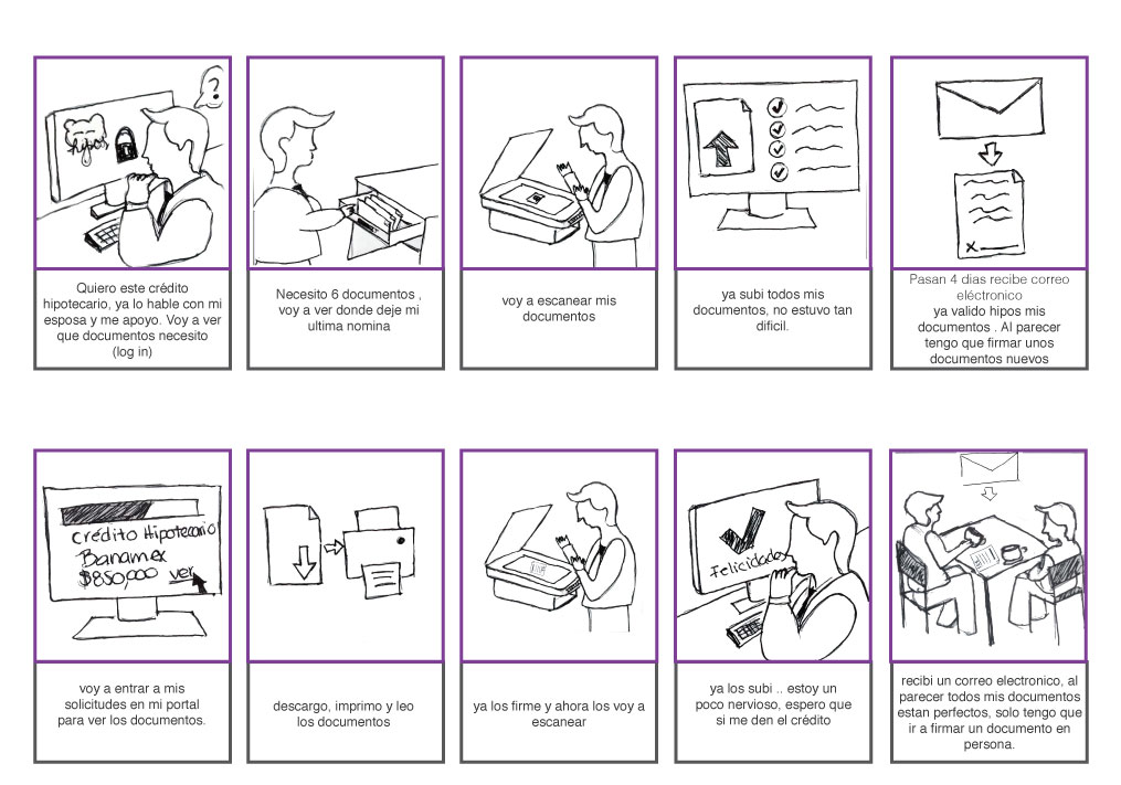
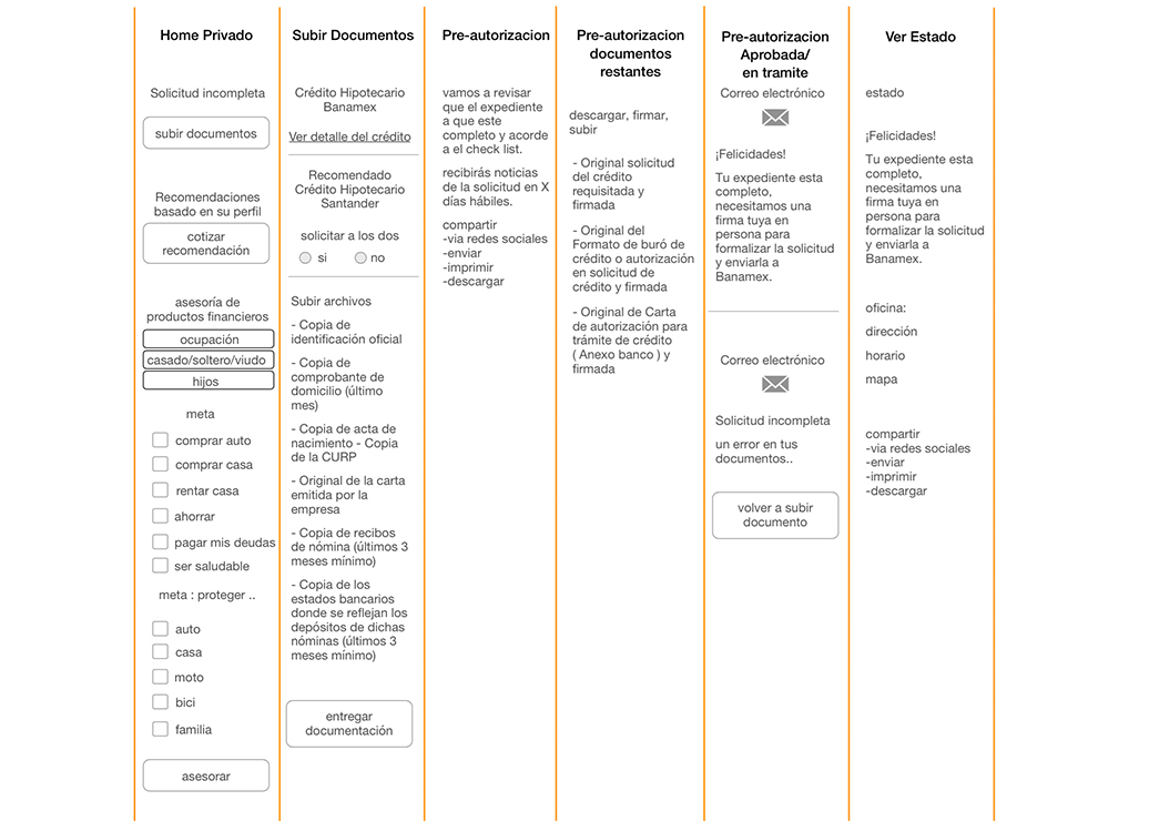
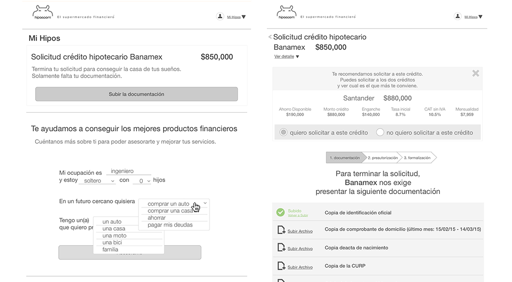
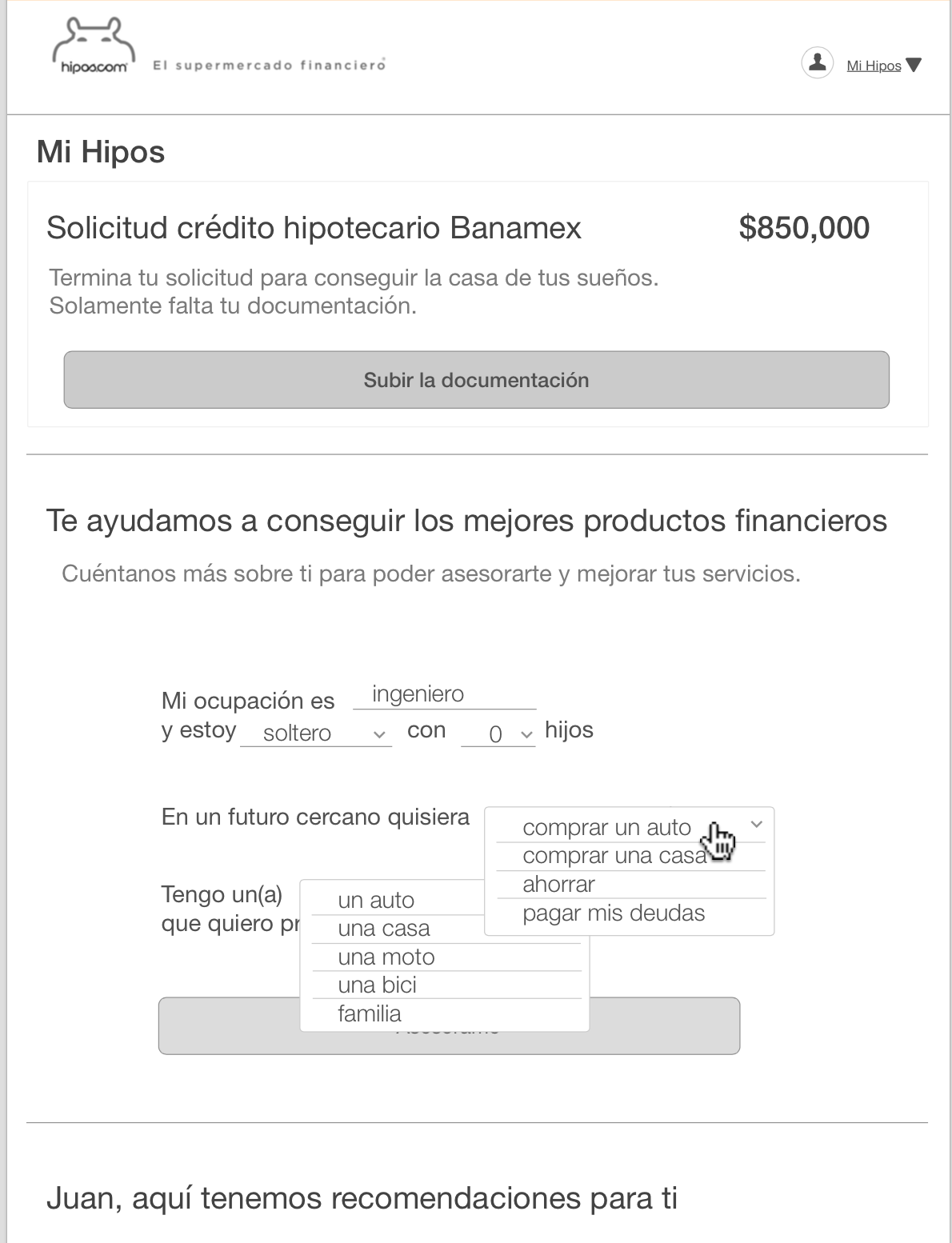
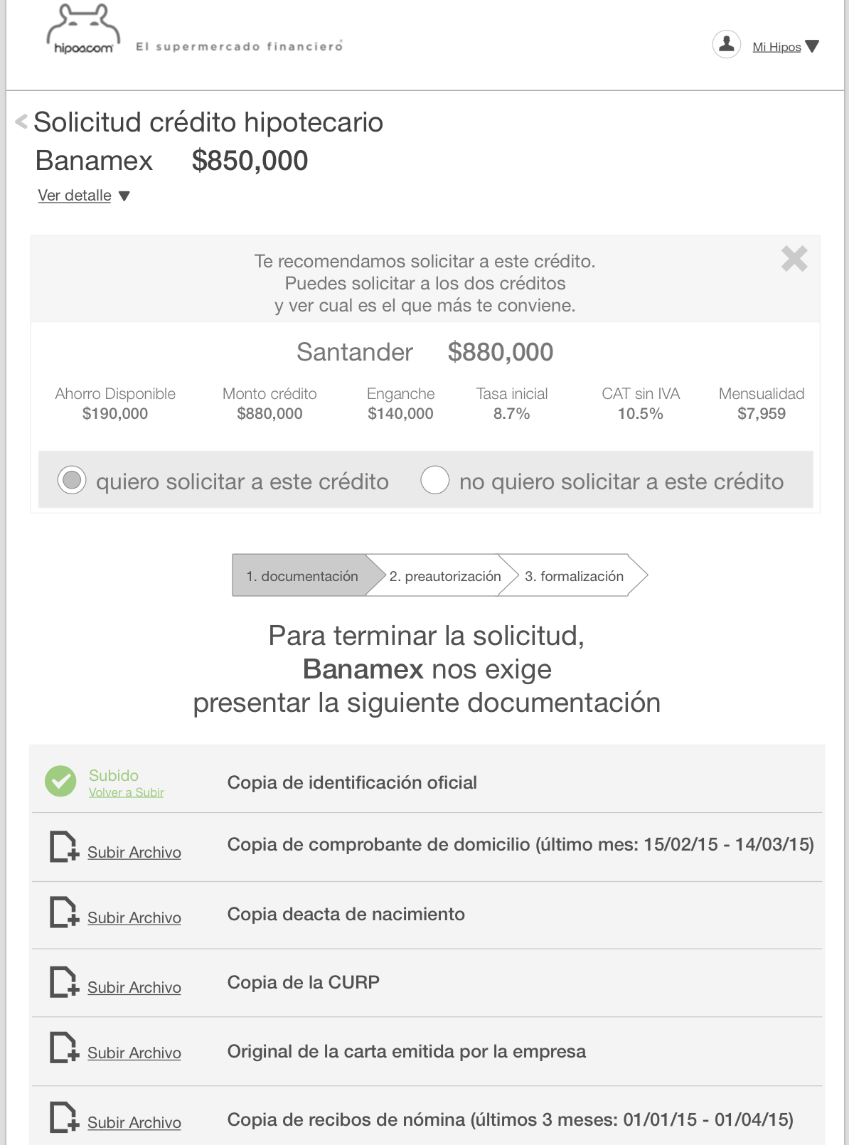
I started out by focusing on their biggest product, mortgages. I gathered competitive analysis. I gathered all the banking requirement forms. I analyzed and negotiated with the client on all the requirements that are needed in order to apply online. There were too many fields that are required. We wanted to give the least amount of forms, so the user wouldn’t get annoyed, confused, or even scared. I created 4 different flows and collaborated weekly with the client to ensure we were going on the right path.
My role
I was the UX designer. I would first present my designs to the CEO of the startup before presenting to our client to make sure we aligned on the concepts. The project manager would include me on meetings via Skype since I was in a remote location. I delivered 4 different flows with their respected wireframes, as well recreated their Public Home page and their blog. I was involved in supervising the visual design process and html to ensure the content was correct.


Challenges
Digesting all the necessary information needed from the user. Mortgages can be overwhelming especially when you are not financial savy. Making sure we asked only the most crucial information was something I felt strongly about.